Installation
The more automated way to install the components into your application is via the gem packaged within this application. The gem provides generators that will setup your applications as best as possible without potentially overwriting any existing code as well as copy components and their dependencies to your application.
Add the Gem
First step is adding the gem to your gemfile.
bundle add shadcn-ui
bundle install
Install and Setup Dependencies
TailwindCSS
The components need a few things in order to render and function properly
Tailwindcss must be installed in your application. If it's not already, I recommend just using the
tailwindcss-railsgem and running its installer to bootstrap your application with TailwindCSS.A few tailwindcss npm packages are required by the theme and the best way to get them is to add them to your package.json or even if you're application doesn't use node packages because you use importmaps or something else, having a package.json will still work only to allow the tailwind cli to compile the themes. The easiest way I've found to include everything you need is by including only one package that will include the rest of them,
tailwind-animate. Create a package.json if you need viaecho '{}' >> package.json.
npm install -D tailwindcss-animate
These are the requirements if you want to add them individually:
@tailwindcss/forms
@tailwindcss/aspect-ratio
@tailwindcss/typography
@tailwindcss/container-queries
tailwindcss-animate
shadcn CSS - Required
shadcn.css
These steps were not automated and are required to be done manually.
The components also require a few CSS variables to be set in order to render properly. It's a two
step process, first, the gem installation should have added app/assets/stylesheets/shadcn.css to
your application. You need to make sure this is included within application.tailwind.css, which
should have happened automatically, but double check.
@import "shadcn.css";
@tailwind base;
@tailwind components;
@tailwind utilities;
shadcn.tailwind.js
The installation also should have added a config/shadcn.tailwind.js file to your application. This
file is required to be included in your tailwind.config.js file. The best way to include it is to
require it in your tailwind.config.js file and expand the configuration settings. This is what a
newly setup tailwind.config.js file should look like after the inclusion of the
shadcn.tailwind.js settings.
const defaultTheme = require("tailwindcss/defaultTheme");
const shadcnConfig = require("./shadcn.tailwind.js");

module.exports = {
  content: [
    "./public/*.html",
    "./app/helpers/**/*.rb",
    "./app/javascript/**/*.js",
    "./app/views/**/*.{erb,haml,html,slim}",
  ],
  theme: {
    extend: {
      fontFamily: {
        sans: ["Inter var", ...defaultTheme.fontFamily.sans],
      },
    },
  },
  plugins: [
    require("@tailwindcss/forms"),
    require("@tailwindcss/aspect-ratio"),
    require("@tailwindcss/typography"),
    require("@tailwindcss/container-queries"),
  ],
  ...shadcnConfig,
};
You could also just use the shadcnConfig as the default Tailwind settings needed are also defined there..
const shadcnConfig = require("./shadcn.tailwind.js");

module.exports = {
  ...shadcnConfig,
};
After that feel free to add further customizatios to your tailwind config. For an existing tailwind config, just add shadcnConfig to the end of the config object. It will override any settings needed by being at the end. And obviously feel free to inspect shadcnConfig and keep only what's reui
End
That's it! You are now set to start installing components via the generator and rendering them into your views.
Manual Installation
Prior to the initial gem release, you can use this as an alpha by cloning this repository and starting up the app as you would a standard rails app.
git clone https://github.com/aviflombaum/shadcn-rails.git
cd shadcn-rails
bundle install
./bin/dev
There are very few dependencies and no database so it should just boot up. Visit http://localhost:3000 to see the demo app which is also the documentation. You'll be able to browse the components at http://localhost:3000/components.
If there's a component you want to try in your app, you will be copying the code from this app to yours. There's a few other steps you'll need.
Installing a Component
Add Tailwind CSS
Components are styled using Tailwind CSS. You need to install Tailwind CSS in your project.
Follow the Tailwind CSS installation instructions to get started.
Add dependencies
If you haven't already, install Tailwind into your rails application by adding tailwindcss-rails
to your Gemfile and install tailwind into your app:
./bin/bundle add tailwindcss-rails
./bin/rails tailwindcss:install
Then install ./bin/rails tailwindcss:install
Configure tailwind.config.js
Here's what my tailwind.config.js file looks like:
const defaultTheme = require("tailwindcss/defaultTheme");

module.exports = {
  darkMode: ["class"],
  content: [
    "./public/*.html",
    "./app/helpers/**/*.rb",
    "./app/javascript/**/*.js",
    "./app/views/**/*.{erb,haml,html,slim}",
  ],
  theme: {
    container: {
      center: true,
      padding: "2rem",
      screens: {
        "2xl": "1400px",
      },
    },
    extend: {
      colors: {
        border: "hsl(var(--border))",
        input: "hsl(var(--input))",
        ring: "hsl(var(--ring))",
        background: "hsl(var(--background))",
        foreground: "hsl(var(--foreground))",
        primary: {
          DEFAULT: "hsl(var(--primary))",
          foreground: "hsl(var(--primary-foreground))",
        },
        secondary: {
          DEFAULT: "hsl(var(--secondary))",
          foreground: "hsl(var(--secondary-foreground))",
        },
        destructive: {
          DEFAULT: "hsl(var(--destructive))",
          foreground: "hsl(var(--destructive-foreground))",
        },
        muted: {
          DEFAULT: "hsl(var(--muted))",
          foreground: "hsl(var(--muted-foreground))",
        },
        accent: {
          DEFAULT: "hsl(var(--accent))",
          foreground: "hsl(var(--accent-foreground))",
        },
        popover: {
          DEFAULT: "hsl(var(--popover))",
          foreground: "hsl(var(--popover-foreground))",
        },
        card: {
          DEFAULT: "hsl(var(--card))",
          foreground: "hsl(var(--card-foreground))",
        },
      },
      borderRadius: {
        lg: "var(--radius)",
        md: "calc(var(--radius) - 2px)",
        sm: "calc(var(--radius) - 4px)",
      },
      fontFamily: {
        sans: ["var(--font-sans)", ...defaultTheme.fontFamily.sans],
      },
      keyframes: {
        "accordion-down": {
          from: { height: 0 },
          to: { height: "var(--radix-accordion-content-height)" },
        },
        "accordion-up": {
          from: { height: "var(--radix-accordion-content-height)" },
          to: { height: 0 },
        },
      },
      animation: {
        "accordion-down": "accordion-down 0.2s ease-out",
        "accordion-up": "accordion-up 0.2s ease-out",
      },
    },
  },
  plugins: [
    require("@tailwindcss/forms"),
    require("@tailwindcss/aspect-ratio"),
    require("@tailwindcss/typography"),
    require("@tailwindcss/container-queries"),
    require("tailwindcss-animate"),
  ],
};
Configure styles
Add the following to your app/assets/stylesheets/application.tailwind.css file.
@tailwind base;
@tailwind components;
@tailwind utilities;

@layer base {
  :root {
    --background: 0 0% 100%;
    --foreground: 222.2 47.4% 11.2%;

    --muted: 210 40% 96.1%;
    --muted-foreground: 215.4 16.3% 46.9%;

    --popover: 0 0% 100%;
    --popover-foreground: 222.2 47.4% 11.2%;

    --border: 214.3 31.8% 91.4%;
    --input: 214.3 31.8% 91.4%;

    --card: 0 0% 100%;
    --card-foreground: 222.2 47.4% 11.2%;

    --primary: 222.2 47.4% 11.2%;
    --primary-foreground: 210 40% 98%;

    --secondary: 210 40% 96.1%;
    --secondary-foreground: 222.2 47.4% 11.2%;

    --accent: 210 40% 96.1%;
    --accent-foreground: 222.2 47.4% 11.2%;

    --destructive: 0 100% 50%;
    --destructive-foreground: 210 40% 98%;

    --ring: 215 20.2% 65.1%;

    --radius: 0.5rem;
  }

  .dark {
    --background: 224 71% 4%;
    --foreground: 213 31% 91%;

    --muted: 223 47% 11%;
    --muted-foreground: 215.4 16.3% 56.9%;

    --accent: 216 34% 17%;
    --accent-foreground: 210 40% 98%;

    --popover: 224 71% 4%;
    --popover-foreground: 215 20.2% 65.1%;

    --border: 216 34% 17%;
    --input: 216 34% 17%;

    --card: 224 71% 4%;
    --card-foreground: 213 31% 91%;

    --primary: 210 40% 98%;
    --primary-foreground: 222.2 47.4% 1.2%;

    --secondary: 222.2 47.4% 11.2%;
    --secondary-foreground: 210 40% 98%;

    --destructive: 0 63% 31%;
    --destructive-foreground: 210 40% 98%;

    --ring: 216 34% 17%;

    --radius: 0.5rem;
  }
}

@layer base {
  * {
    @apply border-border;
  }
  body {
    @apply bg-background text-foreground;
    font-feature-settings:
      "rlig" 1,
      "calt" 1;
  }
}
Copy Component Files
For example, if you want to use the Accordion component, you would copy the following files to your application:
app/javascript/controllers/components/ui/accordion_controller.jsThe Stimulus controller for any component that requires javascript.app/helpers/components/accordion_helper.rbThe helper for the component that allows for easy rendering within views.app/views/components/ui/_accordion.html.erbThe html for the component.
Once those are copied in your application you can render an accordion with:
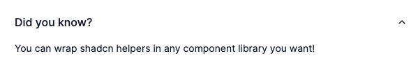
<%= render_accordion title: "Did you know?",
                      description: "You can wrap shadcn helpers in any
                                    component library you want!" %>
Result:
See the component's demo page in app/views/examples/components/accordion.html.erb for more
examples.
This will be similar for each component.
Conclusion
You can freely mix and match both styles as your application evolves. The end goal of each of them is to get the component code into your application so you can further customize and take ownership of your design system.